Development



offtopik
Brand oriented to photography and audiovisual production, needed a website that would function as a portfolio of all its works. Making use of the incredible media library that he had.



axalko
Axalko is a high-class bicycle sales brand, with the creation of frames made of wood using innovative techniques as the main value proposition.


Inicia Psicólogos
The commission consisted of an informative landing page for a psychology consultation. Inicia Psicólogos needed a clean, clear design with a tone and intention …


AEDES
R&D project that seeks to shape new ways of understanding and enjoying the home, hotel stays and other applications in residences or similar AEDES seeks …


Wordofbask
Newly created brand whose activity is based on consulting and product and business development, from a base of extensive experience in generating …



Somno ergo factum
Newly created engineering whose main activity is the research and development of new technologies and value proposals. It required a logo and …


BILKARAST Hostelería
It is a newly created brand that brings together various establishments and hotel services under its name. Bringing together two perspectives such as the contemporary company and …


abadia
Gastrobar Abadia is a bar / restaurant located on Iparraguirre street, at the foot of the beloved mascot of the city of Bilbao. The commission consisted of …
Argus
Roma
Metis
Contacto
Brand oriented to photography and audiovisual production needed a website that would function as a portfolio of all its works.
Using the incredible media library that the client had, a dynamic web page was created using different transition animations and backgrounds of their work.
The result is a constant table of images and videos that serve as a showcase for the brand.
Axalko is a high-class bicycle sales brand, with the creation of frames made of wood using innovative techniques and the use of multiple fibers as the main value proposition.
The generation of an informative and contact landing page in multiple languages was needed that would maintain the sober, elegant and high-standing character of the brand.
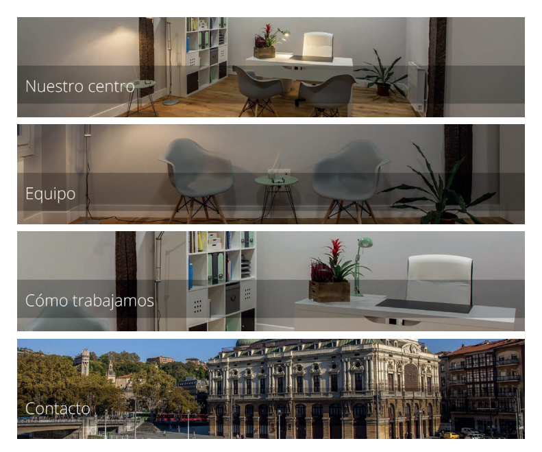
The order consisted of an informative landing page for a psychology consultation.
Initiates Psychologists needed a clean, clear design with a neutral tone and intention.
For the generation, photographic sessions of the facilities and exteriors were carried out, showing the consultation and the fantastic environment.
In this case, the brand logo was given, this project signifying an adaptation of the client’s graphic and conceptual interests.

R&D project that seeks to shape new ways of understanding and enjoying the home, hotel stays and other applications in residences or similar.
AEDES seeks the accessible and modular Smart Home experience through a central platform controlled through a central hub in the form of a mirror, tactile and with voice recognition.
In this way and tailored to each need, a bridge is built towards home automation and digitization and the like, seeking a natural and flexible transition for all users.

Newly created brand whose activity is based on consulting and product and business development.
From a base of extensive experience in the generation of stable businesses and multiple investments, Wordofbask gives its clients the necessary support to see the birth and growth of their business ideas and projects.
From the nomenclature that heads the company (Wordofbask), Basque Word served to attest to the legitimacy of a contract sometimes replaced by a handshake being sufficient.
From the simplicity of the geometric shapes, the handshake is represented, accompanied by a textured color palette that is supported by the stroke of the brush as a reference for the painting to be painted.
Wordofbask was born with the aim of being a seal that, together with its shape and color, to understand the trust and quality carried by the companies that have made use of its services.
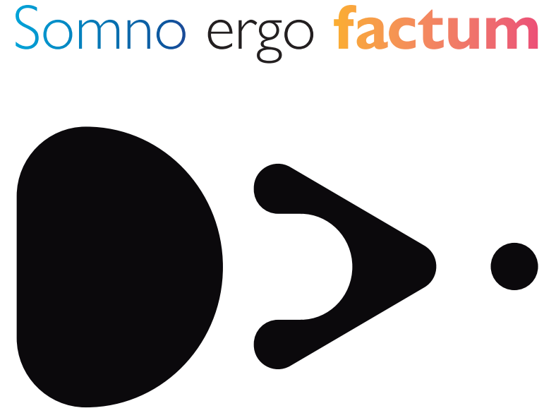
Newly created engineering whose main activity is the research and development of new technologies and value proposals.
It required a logo and an isotype that could work both independently and together.
The concepts to be shown are strongly related to the activity itself, making combinations; Blue – Somno – Research – Play Black and white – Ergo – Core – Value – Warm Circle – Factum – Development – Horizon.
The combination of the elements results in a palette of contrasts and evolution on the way to innovation and new projects.

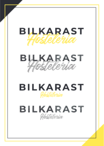
It is a newly created brand that brings together various establishments and hotel services under its name.
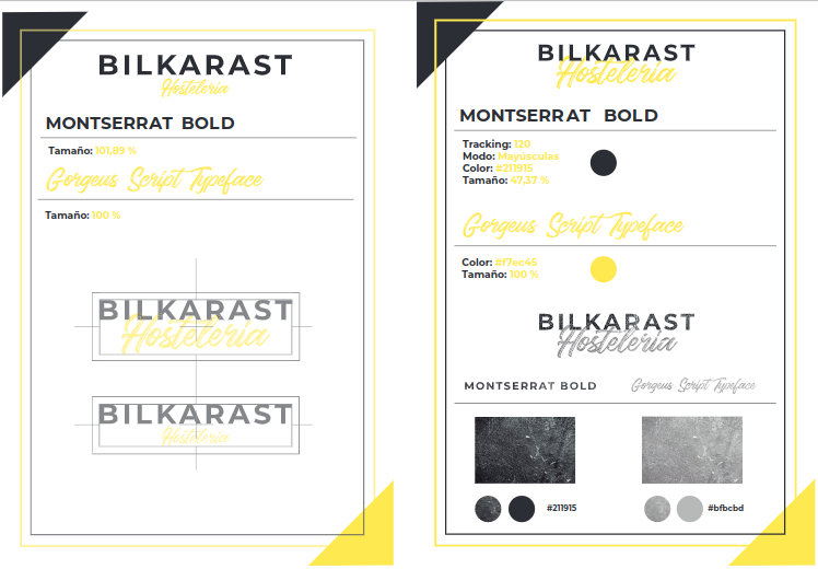
Joining two perspectives such as the contemporary company and the experience of hospitality craftsmanship, the combination of typographic characters arises, on the one hand BILKARAST lacks serifs, with firm and closed geometric shapes that provide solidity and seriousness, on the other, Hospitality is characterized by a handwritten typography, with a marked brush and dynamism.
Finally, the color palette seeks a greater contrast to highlight the second concept and balance the monumentality of the main title.


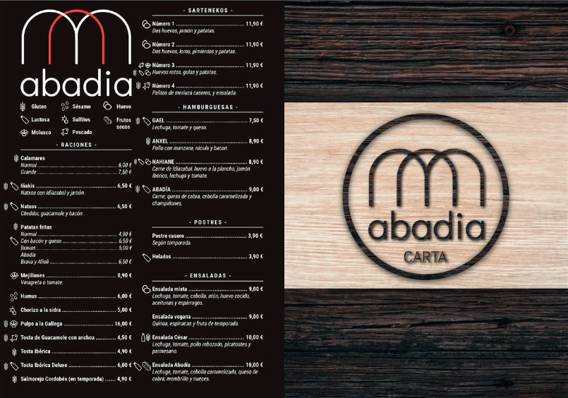
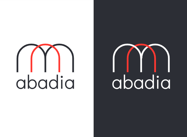
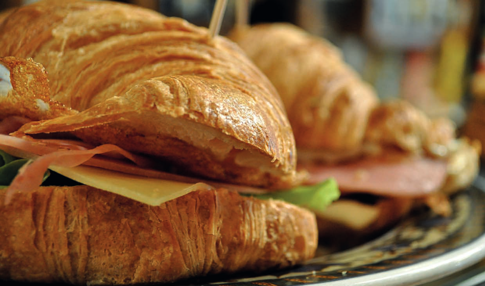
Gastrobar Abadia is a bar / restaurant located on Iparraguirre street, at the foot of the beloved mascot of the city of Bilbao. The commission consisted of the reinterpretation of its brand, redesign of the menu, generation of photographic material for networks and support in the generation of a web portal. Born from the express request of a minimalist concept, the logo seeks simplicity and simplicity through the use of two flat colors and strict shapes, matching the clean and effective service of the place. The photographic material focused on the pride of the hotelier, the pintxos. A photography session was held after which a photographic book of 25 final images was delivered.
Finally, the letter was presented in a Din A-5 format printed on vinyl adhered to PVC, seeking to offer resistance and durability against regular use by customers, being resistant to liquids and blows. The B side of the letter uses images and textures close to wood that reach the union between the origins of the brand and its new perspective.
